Color can completely change how an outfit feels.
The same trousers, jeans, blazer, or dress can look softer, more modern, more polished, or more interesting simply because the color has changed. That is why color trends matter — but only when they work in real life.
For women over 50, the goal is not to chase every runway shade or suddenly dress like a different person. A more useful approach is to find colors that refresh what you already own, flatter you where you wear them, and give you more combinations rather than fewer.
The 2026 palette gives you plenty of room to do that. Softer whites and earthy neutrals sit alongside fresh blues and greens, warm yellow, rich teal, red, turquoise, and muted pink.
Here are 17 practical ways to bring those colors into a wardrobe without losing your personal style.
1. Soft White Is Replacing Harsh Bright White
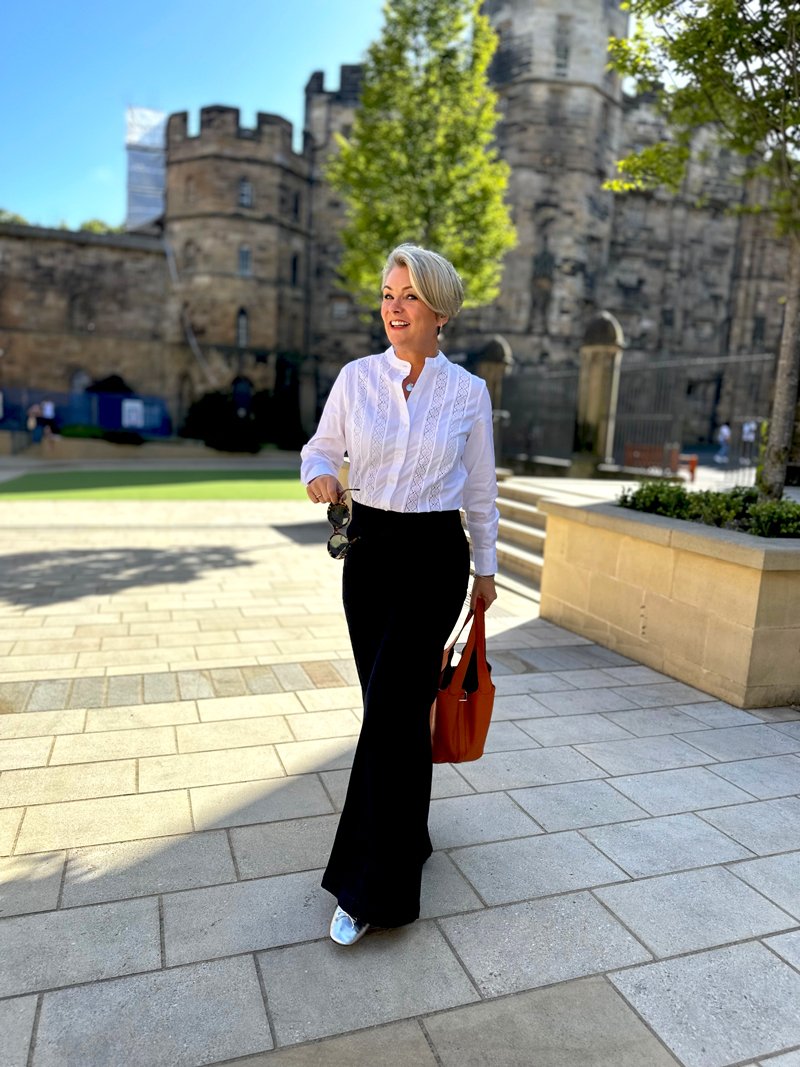
Optic white can look crisp, but it can also feel stark depending on your coloring and the rest of your outfit.
In 2026, softer whites feel more modern. Think cream, ivory, oyster, ecru, and chalky white.
These shades still give you the freshness of white, but they are easier on the face and often look more elegant than a sharp, bright version.
A soft white shirt with jeans, a cream blazer over a dress, or ivory trousers with a knit can make an outfit feel light and polished without looking too severe.
This is one of the easiest color updates because it works with almost everything you already own.
2. Cocoa Brown Feels Richer Than Basic Black
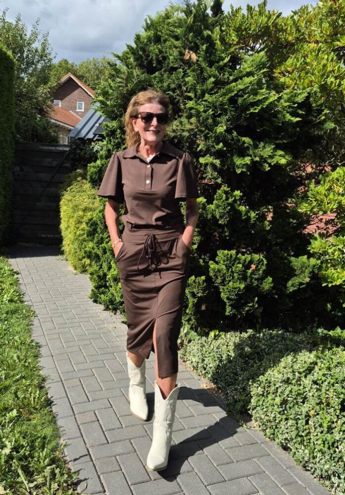
Brown continues to be one of the most useful wardrobe colors, and 2026 leans into richer cocoa and chocolate tones.
Cocoa brown has warmth, depth, and sophistication. It looks especially beautiful in knitwear, leather accessories, wide-leg trousers, loafers, jackets, and soft coats.
If black has started to feel too heavy or repetitive, cocoa brown is a useful alternative. It still feels grounded and refined, but with more warmth.
Try it with ivory, pale blue, olive, blush, denim, or camel. Even a cocoa shoe or handbag can make familiar clothes feel fresher.
3. Sage Green Is One of the Most Wearable Trend Shades

Sage green feels current without demanding too much attention.
It brings color into an outfit, yet it stays soft enough to behave almost like a neutral. That makes it particularly useful if your wardrobe is built around beige, navy, denim, white, and brown.
Try sage in a cardigan, blouse, soft jacket, linen shirt, or tailored trouser.
It works beautifully with white, cream, tan, denim, and chocolate brown. If you are cautious with color, sage is one of the easiest places to begin.
4. Olive Still Matters — But in Cleaner, Softer Ways

Olive is not new, but it continues to earn its place because it is so versatile.
The freshest approach is to style it in a cleaner, more polished way rather than leaning too heavily into a military look.
Think olive trousers with a cream knit, an olive jacket over simple black basics, or an olive shirt dress with gold jewelry.
It works across seasons and travels well because it pairs naturally with white, ivory, denim, black, tan, brown, and stripes.
5. Sky Blue Makes Outfits Feel Light and Fresh

Sky blue has an airy quality that can make an outfit feel instantly fresher.
It works especially well in cotton shirts, lightweight sweaters, linen blouses, dresses, and scarves.
If navy is already one of your wardrobe staples, pale blue is an easy way to bring in a lighter version of the same color family.
Pair it with white, denim, tan, gray, or cocoa. A simple blue shirt with jeans and loafers is an easy outfit that looks polished without feeling overdone.
6. Butter Yellow Is the Soft Way to Wear Yellow

Bright neon yellow can feel intimidating. Butter yellow is much easier.
This softer version adds warmth and color without overwhelming the outfit. It works particularly well in knitwear, cardigans, blouses, lightweight tops, and simple dresses.
Pair it with white, denim, taupe, camel, or soft gray.
If you like the idea of yellow but have never felt comfortable wearing it, start with a softer shade and keep the silhouette familiar.
7. Teal Adds Depth Without Feeling Too Bright
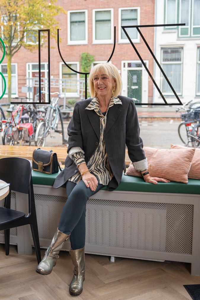
Teal is a strong color, but it has enough depth to feel sophisticated.
That makes it useful for dressier everyday outfits, evening tops, silky blouses, knits, dresses, and accessories.
Teal pairs well with navy, ivory, cocoa, gray, denim, and soft white.
If bright turquoise feels too energetic for a larger garment, teal offers a richer and calmer alternative while still bringing noticeable color near the face.
8. Tomato Red Works Best as a Controlled Statement
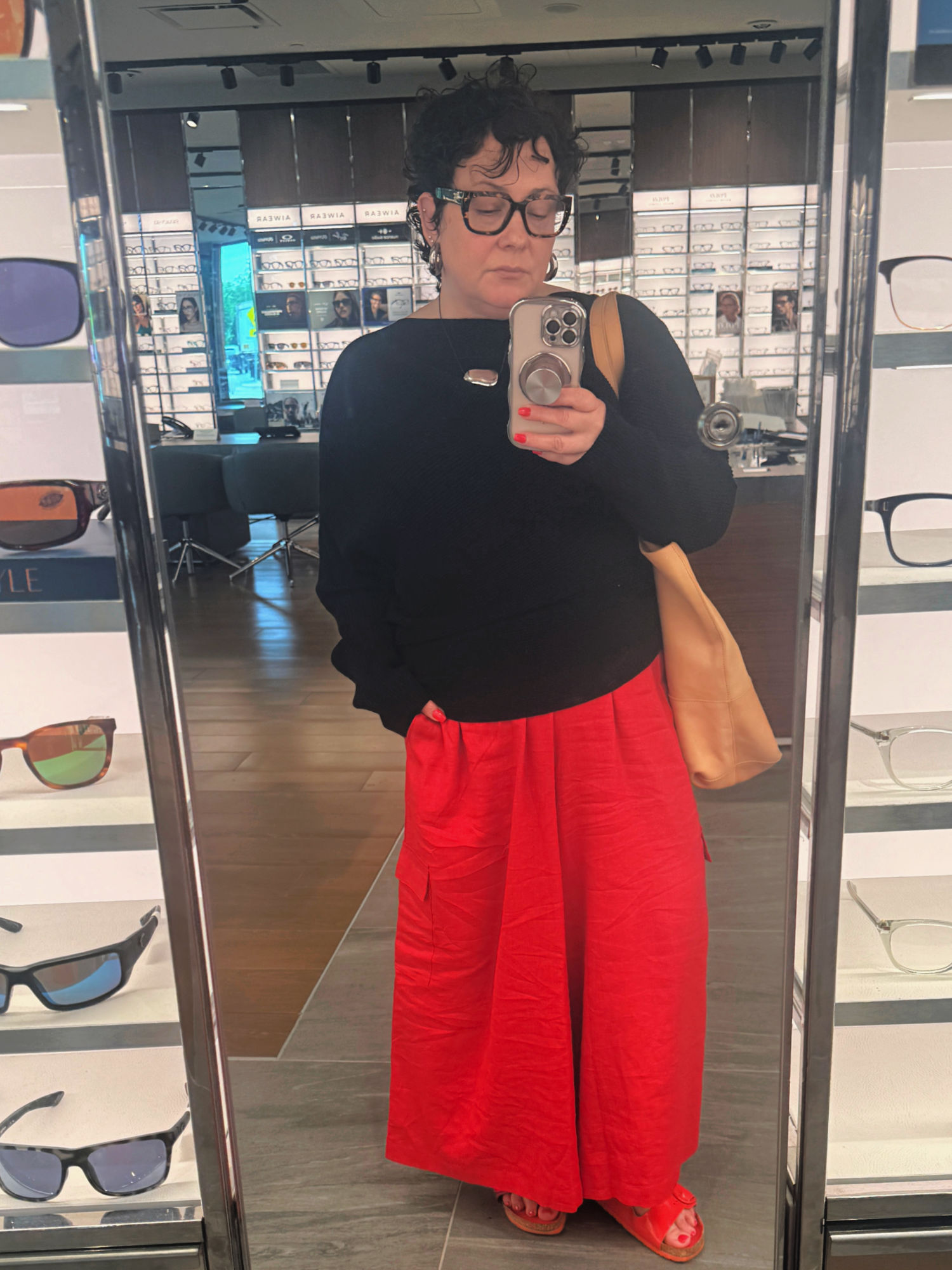
Red can bring energy to even the simplest outfit.
You do not need to wear it head to toe. A pair of red trousers, a cardigan, handbag, flat shoe, or blouse can be enough to wake up a neutral wardrobe.
Tomato red looks especially strong with denim, white, navy, black, camel, and soft brown.
If you are new to red, keep the rest of the outfit simple and let the color be the main event.
9. Turquoise Is Best in Smaller Doses

Turquoise is lively and fresh, but it can be easier to wear as an accent.
Try it in earrings, a necklace, scarf, sandals, handbag, or a single shirt.
Because turquoise has plenty of visual energy, it works best when the rest of the outfit stays relatively calm.
White, tan, denim, navy, gray, and soft brown all make good partners.
10. Blush and Dusty Rose Still Have a Place
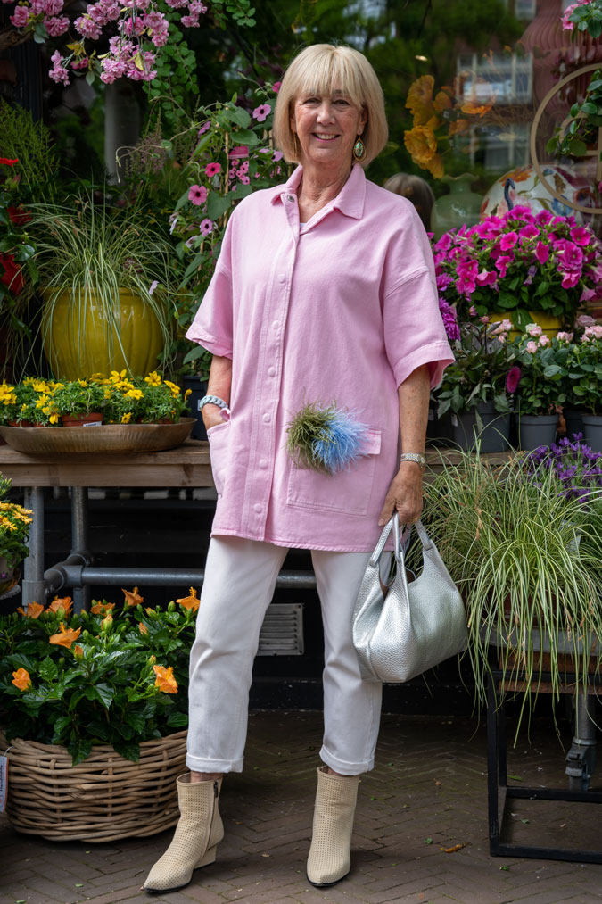
Pink does not have to feel overly sweet.
Blush, dusty rose, and muted pink tones can look soft, flattering, and elegant when they appear in adult silhouettes and good fabrics.
Try them in jackets, fine knits, soft blouses, scarves, coats, or dresses.
These shades pair beautifully with gray, white, cocoa, navy, cream, and olive. They are especially useful when you want warmth near the face without wearing a strong bright color.
11. Use Color Near Your Face First
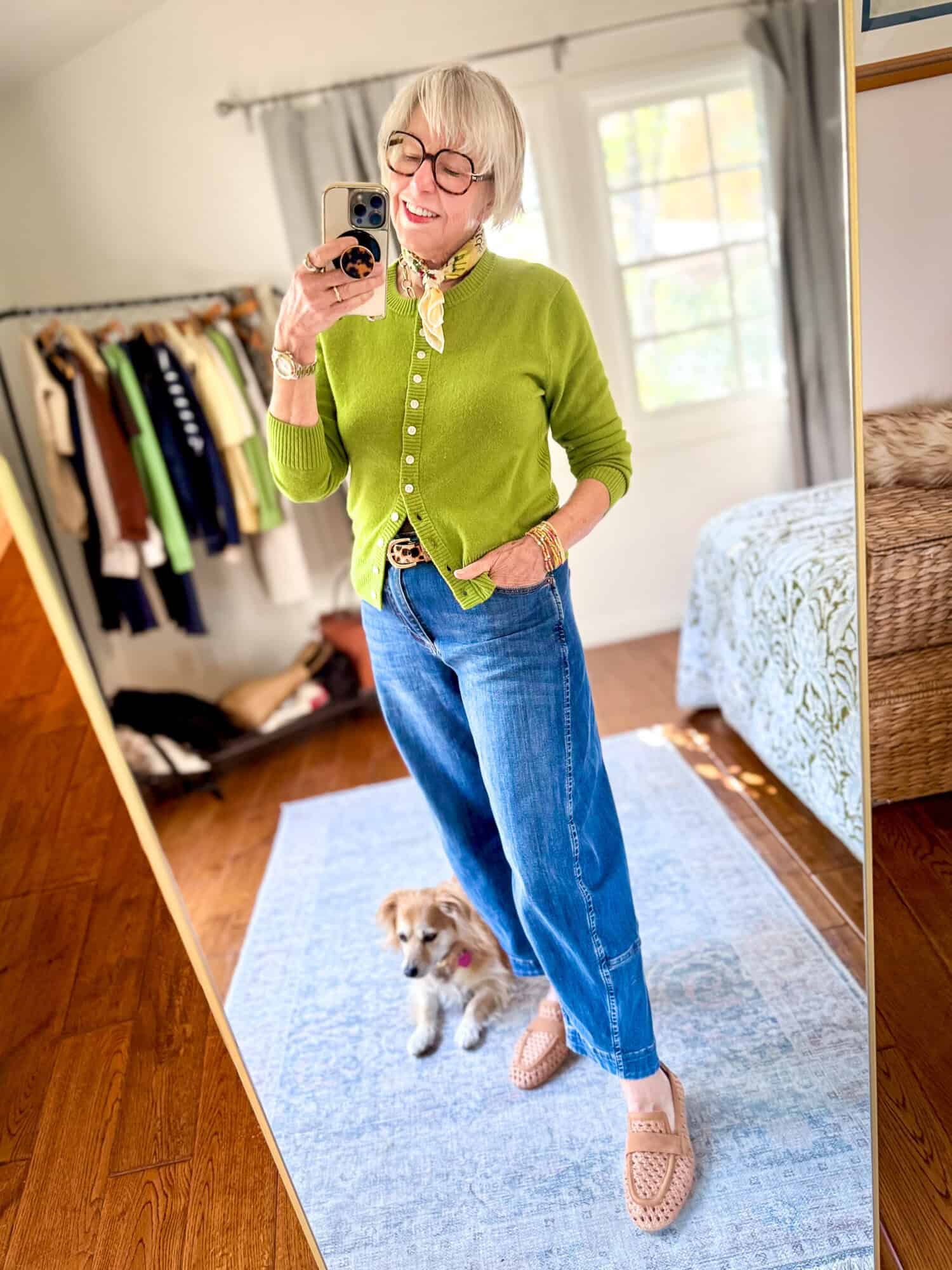
One of the easiest ways to test a new shade is to wear it near your face.
A blouse, knit, scarf, jacket, or earring will quickly show whether the color makes your complexion look brighter or more tired.
If a shade makes you feel fresh and awake, keep it near the face. If you love the color but it feels draining, move it lower in the outfit and wear it as trousers, a skirt, shoes, or a handbag instead.
This approach is much more useful than assuming every trend shade has to work in exactly the same place on every person.
12. Let Fabric Decide How Expensive the Color Looks
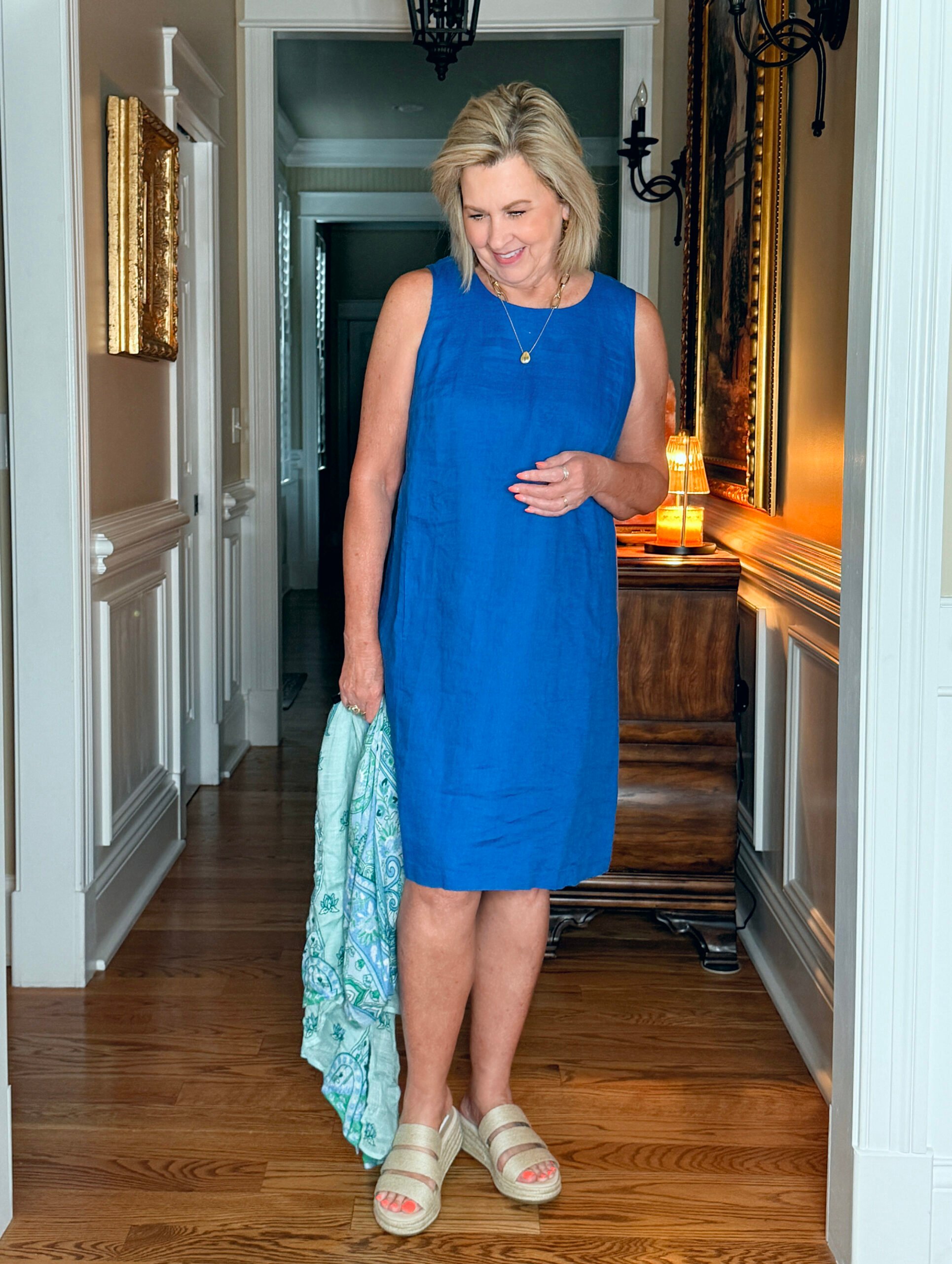
Color and fabric work together.
A beautiful shade can lose its impact in a flimsy or overly shiny fabric, while the same color can look refined in linen, cotton poplin, suede, denim, fine knit, leather, or a soft satin.
Sage looks strong in twill and cotton. Tomato red works well in crisp shirting and accessories. Teal can look especially rich in silky fabrics. Butter yellow works beautifully in a soft knit.
If a color feels wrong, the shade may not be the problem. Sometimes the fabric is.
13. Start With One New Neutral Before Buying Brights

A colorful wardrobe is easier to build when the neutral base is doing its job.
Before buying several bright pieces, consider adding a fresher neutral such as soft white, cocoa, olive, warm beige, or ivory.
These shades give brighter colors somewhere to land.
For example, cocoa trousers make butter yellow easier to wear. Soft white jeans calm down tomato red. Olive gives pale blue or blush more depth.
Good supporting colors often make the statement shades much more useful.
14. Use the One Soft Color + One Accent Formula
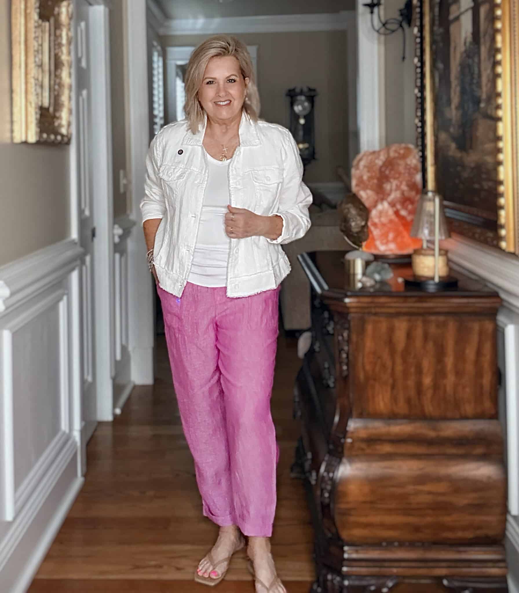
If combining color feels complicated, use a simple formula:
One calm base + one soft color + one small accent.
Try ivory jeans with a sage blouse and red flats, dark denim with a soft white tee and turquoise earrings, cocoa trousers with a pale blue shirt and gold jewelry, or olive pants with a cream knit and tan accessories.
This formula works because there is enough color to make the outfit interesting without creating visual clutter.
15. Match Color to the Occasion
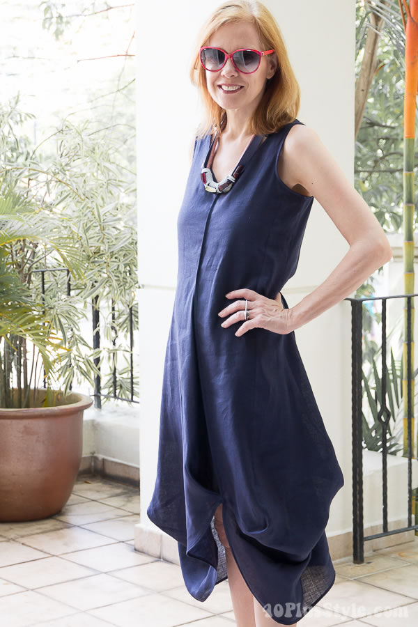
Not every trend shade needs to be worn in the same way.
Soft white, sky blue, butter yellow, sage, and olive are easy choices for daytime and relaxed outfits.
Teal, deep red, cocoa, richer blues, and deeper jewel tones often carry more presence for dinners and dressier occasions.
The goal is not to create rigid rules. It is to use the amount and intensity of color that feels natural for where you are going.
16. Do Not Buy a Trend Color in a Difficult Shape
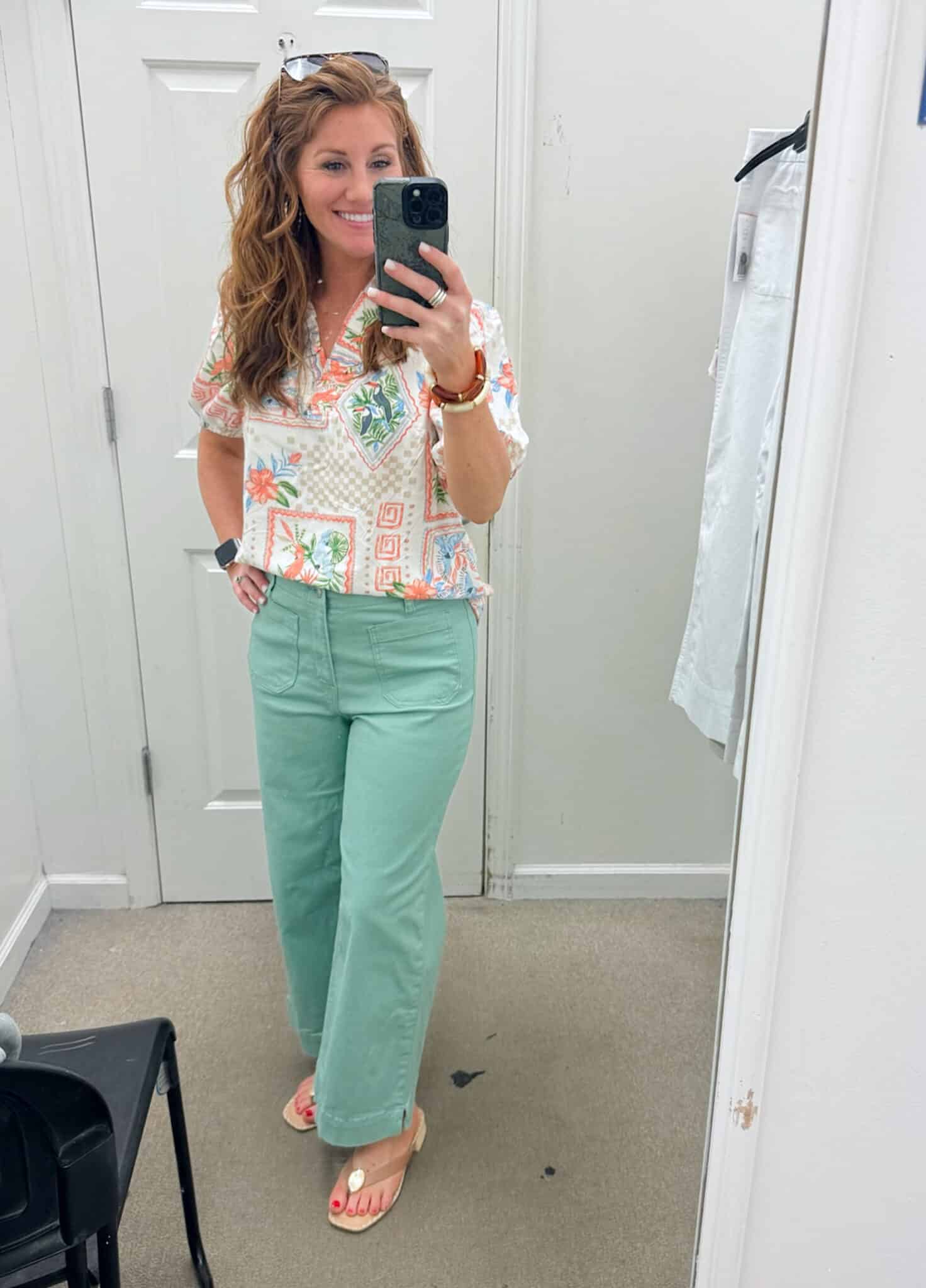
If the color is new to you, keep the garment shape easy.
A classic blouse, simple knit, straight trouser, shirt dress, cardigan, or uncomplicated handbag is much easier to evaluate than an unusual color combined with an extreme silhouette.
When both the color and the shape feel unfamiliar, it becomes difficult to know why you are not reaching for the piece.
Let the color be the new element and keep the rest familiar.
17. Update Your Wardrobe Without Replacing Everything

The smartest way to use 2026 color trends is to update around what you already wear.
You might only need one soft white shirt, one cocoa shoe or handbag, one sage or sky-blue top, and one brighter accent such as red or turquoise.
A few carefully chosen additions can create many new combinations.
Color should make your wardrobe easier and more enjoyable, not turn it into a collection of trend pieces that do not work together.
The Most Wearable 2026 Colors at a Glance
- Soft white
- Cocoa brown
- Sage green
- Olive
- Sky blue
- Butter yellow
- Teal
- Tomato red
- Turquoise
- Blush and dusty rose
Easy Outfit Ideas Using 2026 Colors
- Soft white jeans + sage blouse + tan sandals
- Dark denim + sky blue shirt + cocoa loafers
- Olive pants + cream knit + gold jewelry
- Black trousers + blush top + cocoa handbag
- White shirt + straight jeans + tomato red flats
- Teal blouse + dark jeans + neutral sandals
- Ivory blazer + denim + turquoise earrings
Common Color Mistakes to Avoid
- Wearing several strong trend colors at once when one would be enough.
- Buying a color that does not work with anything already in your wardrobe.
- Ignoring fabric quality when choosing a bright or pale shade.
- Testing an unfamiliar color and an unfamiliar silhouette at the same time.
- Assuming the brightest version of a trend shade is automatically the best version for you.
Frequently Asked Questions
What colors are trending for women over 50 in 2026?
Some of the most wearable directions include soft white, cocoa brown, sage, olive, sky blue, butter yellow, teal, tomato red, turquoise, and muted pink. The best options are the shades that also work with your existing clothes.
Can women over 50 wear bright colors?
Yes. If a bright shade feels stronger than your usual style, introduce it through one top, shoe, handbag, scarf, or jewelry accent and keep the rest of the outfit simple.
What colors make an outfit look polished?
Soft white, cocoa, olive, navy, ivory, and deep teal are useful because they combine easily with classic wardrobe basics. Fabric and fit matter just as much as the color itself.
How do I add trend colors without looking overdone?
Use one trend shade at a time, keep the silhouette simple, and balance it with a familiar neutral. A calm base plus one color usually looks more intentional than several trends competing in one outfit.
Should I replace my wardrobe for 2026 color trends?
No. Add a few colors that combine with pieces you already wear regularly. One new neutral, one softer color, and one brighter accent can create plenty of fresh outfits without rebuilding your wardrobe.
Final Thoughts
Color after 50 does not need to feel intimidating. The point is not to dress louder or younger. It is to choose shades that make familiar clothes feel fresher and more useful.
A softer white, warmer brown, wearable green, lighter blue, or controlled touch of red may be all your wardrobe needs. Choose colors that work with your life, your existing clothes, and the way you actually like to dress.